Important! ***Read before continuing***
Design elements on this page are intended solely to provide visual examples for how content can be organized on a page using Navigation and Module functionality. Should you find a design element on this page that you would like to utilize, reach out to webmaster@uah.edu with your ideas. Then, we (the OMC web team) will determine the best solutions for your needs and how to implement them. Design elements on this page are not intended for you to implement.
In addition to standard HTML markup, found on the Base HTML Elements page, there are a number of custom modules and elements designed specifically for the UAH website. This page will illustrate those elements and provide guidelines for their use.
- News Tile Module
- Nav Tile Module
- Two-Block Spotlight Module
- Small Spotlight Module
- Recent News
- Link Grid
- Link List
- Section Menu
- Jump-To-Section
- Faculty/Staff Listing
News Tile Module
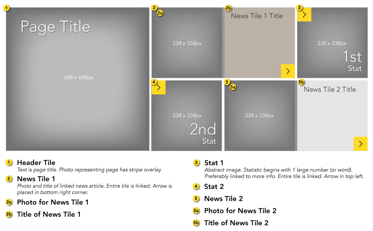
The news tile module is great for colleges or centers that generate a lot of news they want to feature on their front pages. It displays the page title, two featured news stories, and two statistics or brag facts. Remember to use news and stats that are relevant to prospective students.
Usage
The news tile module is limited to usage on major section of the UAH website such as college front pages. To request to use this module, contact webmaster@uah.edu.
How often should news be updated?
News articles displayed here should be marketing-focused. Generally they can be displayed for up to 6 months before being replaced. To display articles that rotate more frequently, consider using the recent news module.
Diagram
Nav Tile Module
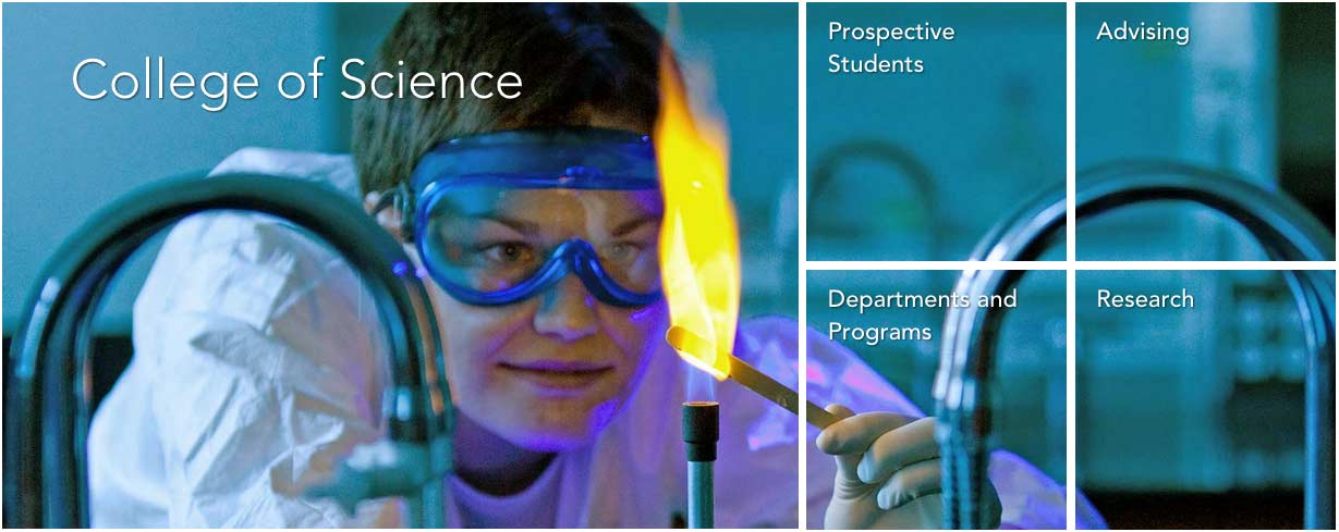
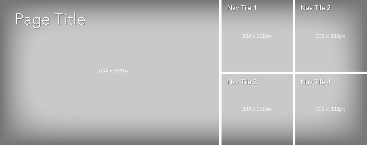
The nav tile module is better suited for colleges and centers that don't want to especially feature news on their front pages. Instead, the tiles display one large image and feature important links. Each link tile flips to display a relevant photo when visitors hover over it (on mobile the tiles are flipped by default with a blue overlay for legibility). The nav tile module is only available for use on college front pages. Remember to choose links that are important to prospective students.
Usage
The news tile module is limited to usage on major section of the UAH website such as college front pages. To request to use this module, contact webmaster@uah.edu.
Photo Selection
Choosing the right photo for the nav tile module can be tricky. Photos that work best have the subject in the middle or middle-left. For legibility of the links it's important that the right side of the photo isn't too bright or busy. The original background photo used to build your module should be at least 1738 x 688.
Diagram
Two-Block Spotlight Module
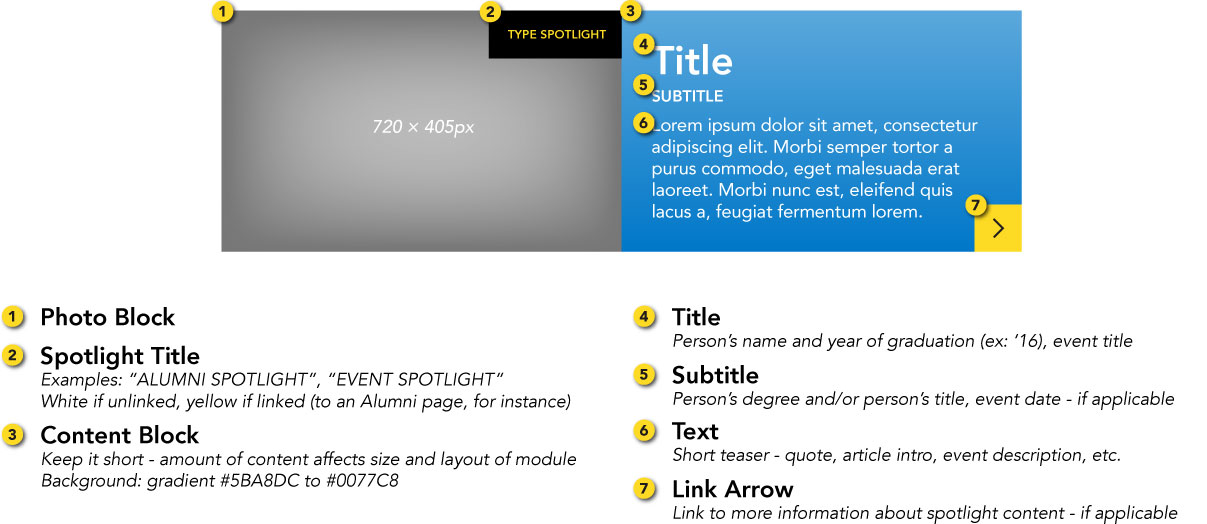
The two-block spotlight is used within the body of a web page to feature an event or a person, usually a current student or an alumni.
Automatic Image Cropping
Images are cropped automatically based on the height of the text. Notice in this diagram how the image is cropped when the length of the text is increased.
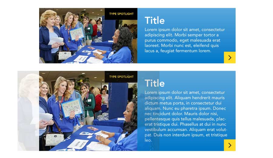
Alternate Image Cropping
Photos are cropped at the top-center by default. You can force different crops by adding specific classes to div.block-left.
- middle-center crop -
.pos-center - bottom-center crop -
.pos-bottom - middle-left crop -
.pos-left - middle-right crop -
.pos-right - top-left crop -
.pos-topleft - top-right crop -
.pos-topright
Diagram
Example
Open House
The open house program at UAH is a great way to discover what matters most to you.
 Open House - Apr 11


APR 11


Open House
The open house program at UAH is a great way to discover what matters most to you.
60/40 Two-Block Spotlight
While most two-block spotlights are split 50/50 photo-to-content, 60/40 two-block spotlights, which feature a wider image, are reserved for modules that feature interactive content, such as a video or interactive map.
Example
Rachel Bray '15
Accounting, College of Business
"Being involved has really developed me as a leader and helped me grow as a person."
Rachel Bray '15
Accounting, College of Business
"Being involved has really developed me as a leader and helped me grow as a person."
Rachel Bray '15
Accounting, College of Business
"Being involved has really developed me as a leader and helped me grow as a person."
Small Spotlight Module
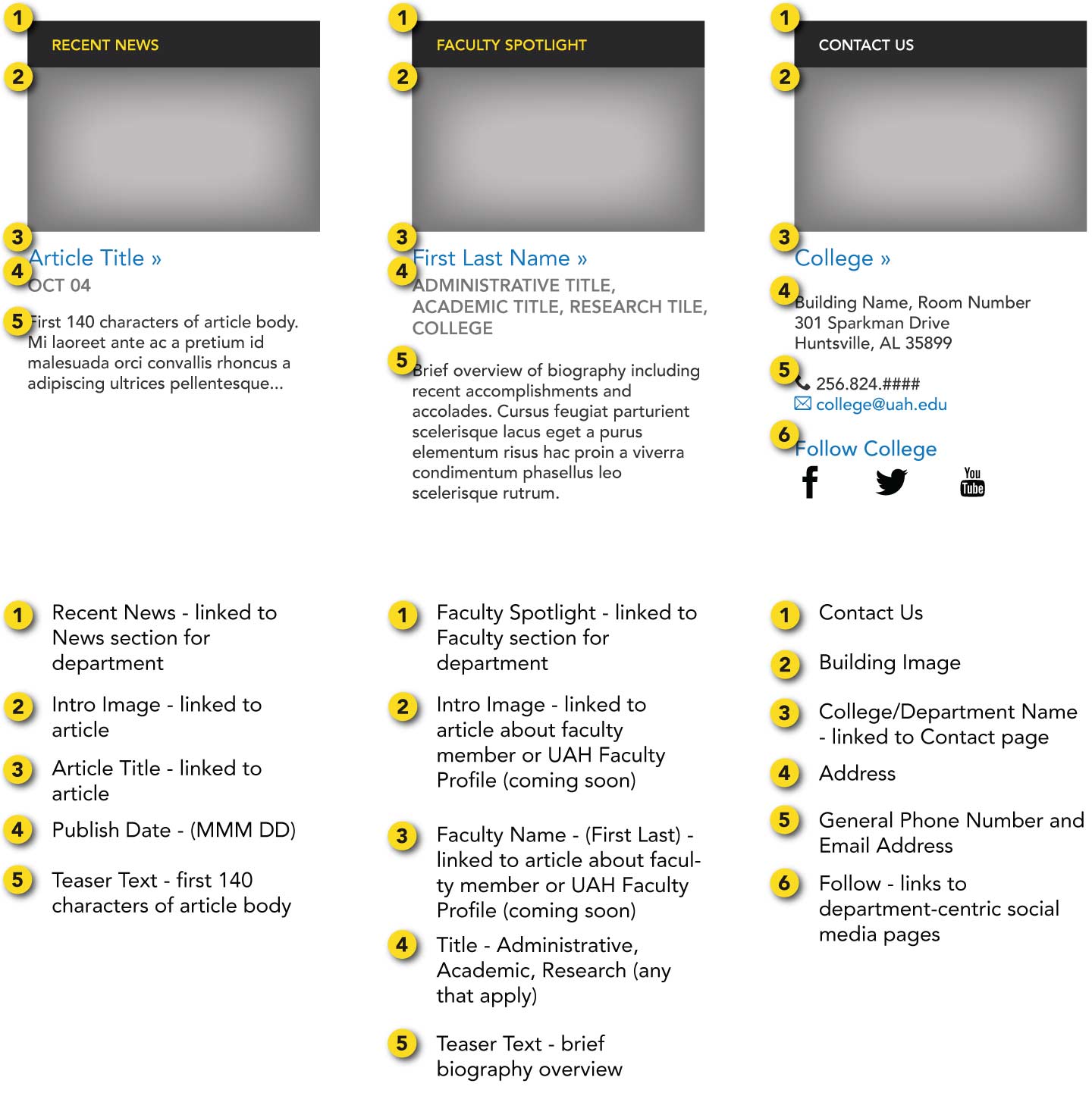
The small spotlight module is primarily used to feature recent news stories, people (faculty, students, etc.), and contact information. They can be used individually in the right sidebar or three-to-a-row at the bottom of a page, such as on college/department pages.
Diagram
Example
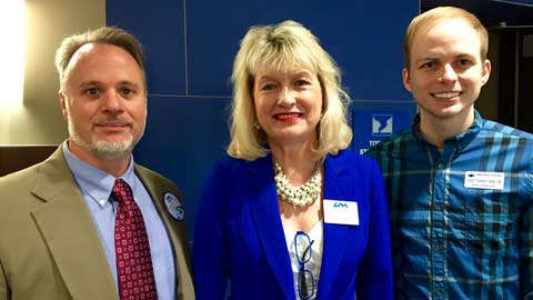
UAH's College of Nursing hosts first annual Student Nurses Leadership Summit
Mar 24Faculty Spotlight

Louise O'Keefe
Assistant ProfessorLouise C. O'Keefe, assistant professor of nursing in the UAH College of Nursing was recently honored by the prestigious organization the American Association of Nurse Practitioners (AANP) with a 2014 State Award for Excellence.
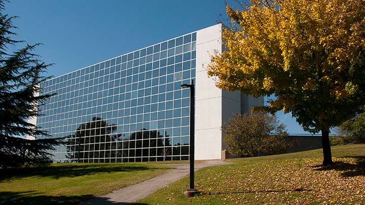
College of Nursing
301 Sparkman Drive
Nursing Building 207
Huntsville, AL 35899
256.824.6742
nursing@uah.edu
 Recent News


 UAH's College of Nursing hosts first annual Student Nurses Leadership Summit


               Mar 24
The Alabama Association of Nursing Students (AANS), a state constituent chapter of the National Student Nurses' Association (NSNA), presen…


Faculty Spotlight


Louise O'Keefe


       Assistant Professor
Louise C. O'Keefe, assistant professor of nursing in the UAH College of Nursing was recently honored by the prestigious organization the American Association of Nurse Practitioners (AANP) with a 2014 State Award for Excellence.


 Contact Us

College of Nursing


 301 Sparkman Drive

        Nursing Building 207

        Huntsville, AL 35899


         256.824.6742

        nursing@uah.edu
Recent News
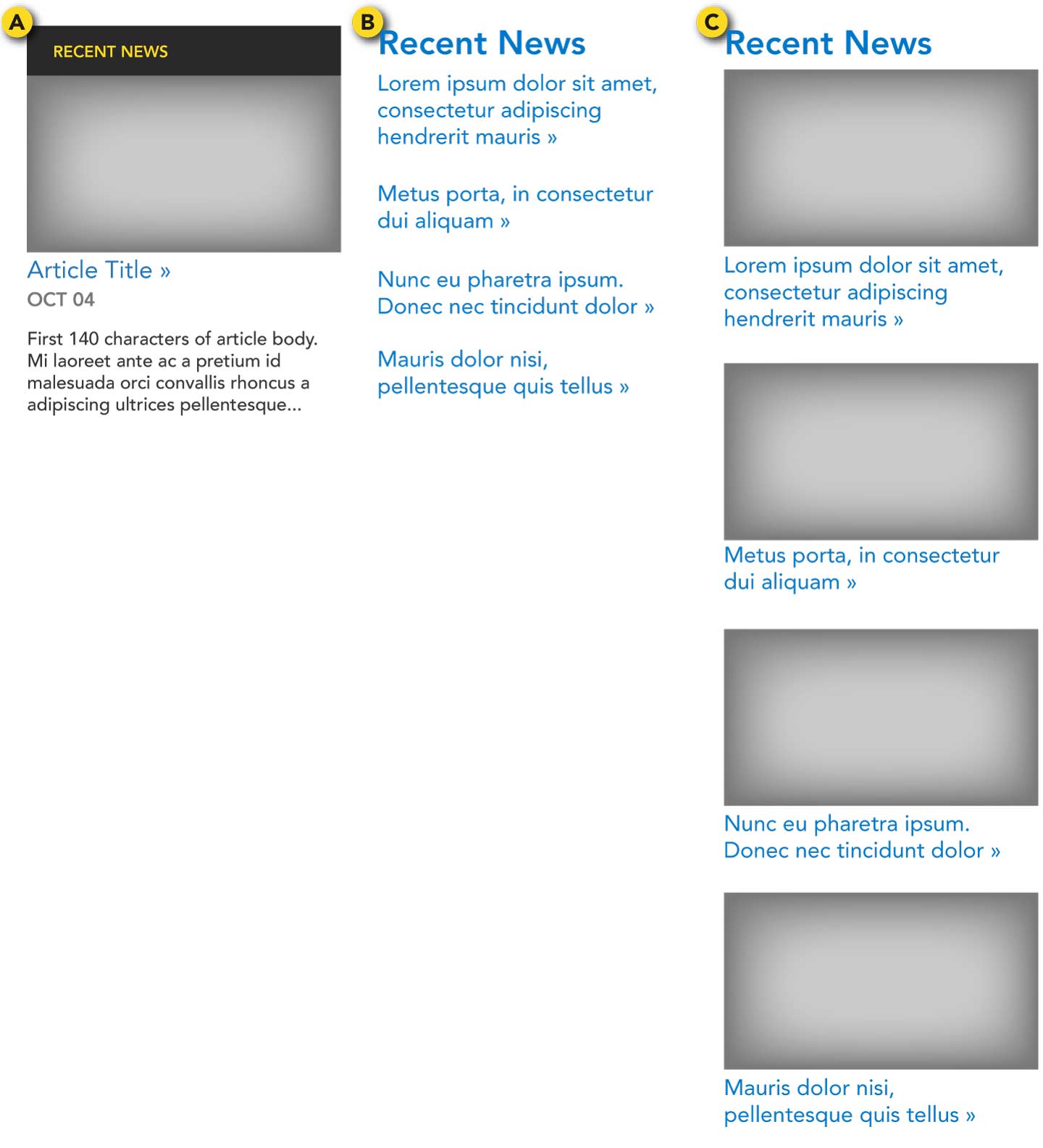
Recent news modules display the most recent featured news article categorized under a specific department.
How often should news be updated?
Recent news articles should be changed at least once every few weeks. For news that should display for a longer time, consider the news tile module.
Note
Featured articles written by the Office of Marketing and Communications will automatically be pushed to the recent news module as well as the News page for the applicable college/department.
There are three options to display news on a page: (Choose only one type per page)
- 1 article spotlight - 1 spotlight article with linked photo, linked title, date, and teaser text (see the previous section: Small Spotlight Module)
- Multiple articles w/o photos - 3-5 articles, each with linked title
- Multiple articles w/ photos - 3-5 articles, each with linked photo and linked title
Diagram
Example
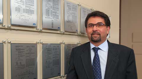
Three commercially viable proposals win CIF awards at UAH
Apr 07Link Arrow
The link arrow is used on a tile or image to indicate that visitors may click it to visit a page with more information.
Link Grid
The link grid is designed to present a list of links of the same type of content, such as a list of programs offered by a college or a list of menu items within a section.
Remaining empty spaces are filled with the blue stripe pattern. The link grid should have a heading where applicable. The .narrow class is used to reduce the links' text size.
| Left Menu | No Left Menu | |
|---|---|---|
| Right Sidebar | 3 columns .narrow |
3 columns |
| No Right Sidebar | 3 columns | 4 columns |
Example
Undergraduate Programs
Narrow
Undergraduate Programs
Narrow
Link List
The link list, similar to the link grid, is used to display a number of related links. Link lists are most often shown in the right sidebar.
Example
Related Links
Section Menu (Left Menu)
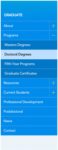
The section menu allows visitors to navigate to other pages within a particular section of the website.
- On smaller screens, the section menu is off-screen until the user taps on the yellow tab.
- The heading is linked to the front page of the current section.
- Visitors may click on a link to go to that page, or they can click the + to see and navigate to that page's subpages.
- The current page is highlighted
Important
- Menu items must be linked to a page.
- The section menu is the only module or content that may be displayed in the left column of the website.
- Avoid adding links to outside websites or other sections on the UAH website. Instead, these links can be displayed within the web page.
Example
The example below is just a screenshot. Refer to the section menu on this page to see a live example.
Jump-To-Section
For pages that are unavoidably very long, a Jump-to-Section menu in the right sidebar can help users quickly find the section they need.
Example
Jump to Section
Federal Loans
Private Loans
Private Loans
Faculty/Staff Listing
Example
Pages that list faculty, staff, students, and team members are managed using the Profile Builder. Profiles are created then assigned to listing categories which control where and how they appear across the site. If your responsibilities requires you have access to create or edit profiles in the Profile Builder, remember that most departments already have someone designated as their Profile Builder editor. However, if nobody is in this role, if you are not sure who the editor is on your team, or if you think you should also have access, send your questions to webmaster@uah.edu and we will be in contact.

