This page provides examples of the basic HTML elements used to create pages on uah.edu. For examples of custom modules found on the UAH site, see the Navigation & Modules page.
Template Overview
The uah.edu template is based upon the Bootstrap 3 framework. There are more Bootstrap-created elements and styles available in the uah.edu template that are not listed on this page. For complete Bootstrap documentation, visit getbootstrap.com.
Responsive Design
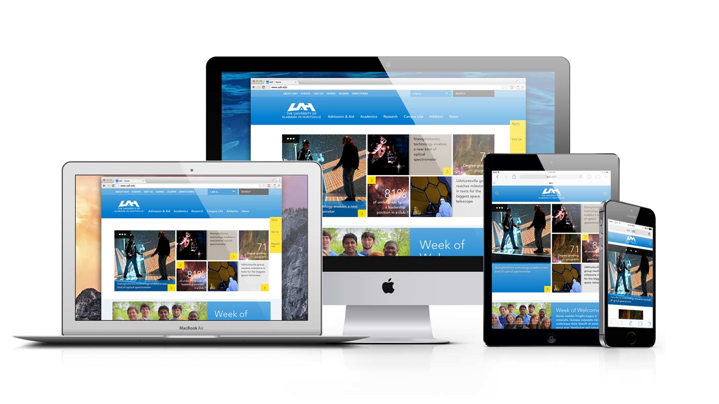
The UAH website is responsive, meaning the layout of each page changes based on the size of the visitor's screen (or the browser window). Ensure your content displays correctly across all these screen sizes.
Here are some prominent examples of layout changes visible on smaller screens:
- header condenses
- tile modules rearrange and condense
- sidebars wrap to below the main content
- menus move off screen
- images shrink
Grid System
The UAH website is based on a 12-column grid. Images and other elements are resized on the page by assigning how many columns (of 12) wide each should be for a particular screen size. For example, an image with the class .col-xs-6 is 6 columns wide of a total 12, meaning it's half the width of the page for XS-sized screens and up.
For more information on the grid system refer to the Bootstrap grid system documentation.
Basic-Grid
Columns and padding are colored for illustrative purposes.
Twelfths
Example
.col-md-1
.col-md-1
.col-md-1
.col-md-1
.col-md-1
.col-md-1
.col-md-1
.col-md-1
.col-md-1
.col-md-1
.col-md-1
.col-md-1
Halves
Example
.col-sm-6
.col-sm-6
Thirds
Example
.col-sm-8
.col-sm-4
Example
.col-sm-4
.col-sm-4
.col-sm-4
Quarters
Example
.col-sm-3
.col-sm-3
.col-sm-3
.col-sm-3
Narrow Grid
Add .row-narrow to the row div to reduce the padding between columns.
Example
.col-sm-3
.col-sm-3
.col-sm-3
.col-sm-3
Multirow Grid
Add .multi to the row to create a gallery-like grid, in which each column matches the height of its adjacent columns. Columns are given a top and bottom padding in addition to the left and right padding. Note: Each column must be the same width.
Break Points
There are several predefined screen widths at which major layout changes occur. These are called “break points.”
| Extra-small devices | Small devices | Medium devices | Large devices | |
|---|---|---|---|---|
| Screen/browser width | <700px | ≥700px | ≥900px | ≥990px |
| Example devices | Phones | Tablets-portrait, iPad-portrait, etc. | Small browser windows, etc. | Tablets-portrait, iPad-landscape, laptops, desktops, etc. |
| Class prefix | .col-xs- | .col-sm- | .col-md- | .col-lg- |
Typography
Headings
Organize your content by using the appropriate headings: h2 through h6. Heading 1 is reserved for page titles. Since the page title is pre-set, you will never use Heading 1. Headings 2-6 should be used in descending order by hierarchy. Headings are not to be used solely for layout or just for promoting important text. Headings are used to categorize the related content below. Think of headings like you would when writing a report. The largest heading is used at the top of the page. Sub headings are used in descending order by hierarchy. Just like you would never skip headings in a report, you would never skip headings on your page.
Example
Heading 1 with small text and a link
Heading 2 with small text and a link
Heading 3 with small text and a link
Heading 4 with small text and a link
Heading 5 with small text and a link
Heading 6 with small text and a link
Body Copy
Standard body copy is 18px in size and uses the Red Hat Text typeface. Add .lead to the first paragraph of a page to present a brief introduction or overview of that page.
Example
This is a lead paragraph. Lorem ipsum dolor sit amet, consectetur adipiscing elit. Aliquam hendrerit mauris dictum metus porta, in consectetur dui aliquam. Nunc eu pharetra ipsum.
This is a standard paragraph. Lorem ipsum dolor sit amet, consectetur adipiscing elit. Aliquam hendrerit mauris dictum metus porta, in consectetur dui aliquam. Nunc eu pharetra ipsum.
Common Text Elements and Styles
Example
Link - Use to link to another page or website.


Strong - Use to bring extra attention to a word or phrase.


Emphasis - Use to emphasize a word or phrase.


Small - Use to de-emphasize a word or phrase.


Subscript - H2O is a subscript example.


Superscript - May 20th is a superscript example.


Abbreviation - Long words or terms such as HTML can be abbreviated.


Line Indent - Add the class .indent-line to indent the first line of a paragraph. Lorem ipsum dolor sit amet, consectetur adipiscing elit. Aliquam hendrerit mauris dictum metus porta, in consectetur dui aliquam. Nunc eu pharetra ipsum. Donec nec tincidunt dolor. Mauris dolor nisi, pellentesque quis tellus malesuada, placerat tristique dui. Phasellus at dui in nunc vestibulum accumsan.

Paragraph Indent - Add the class .indent-paragraph to indent the first line of a paragraph. Lorem ipsum dolor sit amet, consectetur adipiscing elit. Aliquam hendrerit mauris dictum metus porta, in consectetur dui aliquam. Nunc eu pharetra ipsum. Donec nec tincidunt dolor. Mauris dolor nisi, pellentesque quis tellus malesuada, placerat tristique dui. Phasellus at dui in nunc vestibulum accumsan.
Centering Content
Keep in mind that the UAH website doesn't center content. Content is left-aligned. advertisements, buttons, titles, lists, are just a few examples of content that should be left aligned, and not centered on the page.
Link - Use to link to another page or website.
Strong - Use to bring extra attention to a word or phrase.
Emphasis - Use to emphasize a word or phrase.
Small - Use to de-emphasize a word or phrase.
Subscript - H2O is a subscript example.
Superscript - May 20th is a superscript example.
Abbreviation - Long words or terms such as HTML can be abbreviated.
Line Indent - Add the class .indent-line to indent the first line of a paragraph. Lorem ipsum dolor sit amet, consectetur adipiscing elit. Aliquam hendrerit mauris dictum metus porta, in consectetur dui aliquam. Nunc eu pharetra ipsum. Donec nec tincidunt dolor. Mauris dolor nisi, pellentesque quis tellus malesuada, placerat tristique dui. Phasellus at dui in nunc vestibulum accumsan.
Paragraph Indent - Add the class .indent-paragraph to indent the first line of a paragraph. Lorem ipsum dolor sit amet, consectetur adipiscing elit. Aliquam hendrerit mauris dictum metus porta, in consectetur dui aliquam. Nunc eu pharetra ipsum. Donec nec tincidunt dolor. Mauris dolor nisi, pellentesque quis tellus malesuada, placerat tristique dui. Phasellus at dui in nunc vestibulum accumsan.
Multi-column paragraphs
Paragraphs or blocks of text can be made to display across two or three columns, evenly dividing the text. Use the class .twocolumn-xs or .threecolumn-xs to apply this style on all screen sizes. Use .twocolumn-sm or .threecolumn-sm to apply this style to screen sizes larger than extra-small.
Example
This is a two-column paragraph. Lorem ipsum dolor sit amet, consectetur adipiscing elit. Vivamus a urna ut nulla pellentesque feugiat ac vel libero. Sed sit amet convallis augue, sit amet tempus enim. Pellentesque maximus rhoncus orci, eget ultricies odio scelerisque quis. Donec tempus lorem non risus fermentum, ut laoreet lectus aliquet. Nam sed pulvinar diam, sed semper quam. Fusce at porta mi. Morbi nec turpis fringilla, porta ligula eu, suscipit turpis. Sed vel dui urna. Donec ex risus, pulvinar eget odio in, vehicula eleifend velit. Vestibulum ut justo ut nulla egestas porttitor. Integer nunc ex, interdum in felis vel, dapibus lacinia sem.


This is a three-column paragraph. Lorem ipsum dolor sit amet, consectetur adipiscing elit. Vivamus a urna ut nulla pellentesque feugiat ac vel libero. Sed sit amet convallis augue, sit amet tempus enim. Pellentesque maximus rhoncus orci, eget ultricies odio scelerisque quis. Donec tempus lorem non risus fermentum, ut laoreet lectus aliquet. Nam sed pulvinar diam, sed semper quam. Fusce at porta mi. Morbi nec turpis fringilla, porta ligula eu, suscipit turpis. Sed vel dui urna. Donec ex risus, pulvinar eget odio in, vehicula eleifend velit. Vestibulum ut justo ut nulla egestas porttitor. Integer nunc ex, interdum in felis vel, dapibus lacinia sem.
This is a two-column paragraph. Lorem ipsum dolor sit amet, consectetur adipiscing elit. Vivamus a urna ut nulla pellentesque feugiat ac vel libero. Sed sit amet convallis augue, sit amet tempus enim. Pellentesque maximus rhoncus orci, eget ultricies odio scelerisque quis. Donec tempus lorem non risus fermentum, ut laoreet lectus aliquet. Nam sed pulvinar diam, sed semper quam. Fusce at porta mi. Morbi nec turpis fringilla, porta ligula eu, suscipit turpis. Sed vel dui urna. Donec ex risus, pulvinar eget odio in, vehicula eleifend velit. Vestibulum ut justo ut nulla egestas porttitor. Integer nunc ex, interdum in felis vel, dapibus lacinia sem.
This is a three-column paragraph. Lorem ipsum dolor sit amet, consectetur adipiscing elit. Vivamus a urna ut nulla pellentesque feugiat ac vel libero. Sed sit amet convallis augue, sit amet tempus enim. Pellentesque maximus rhoncus orci, eget ultricies odio scelerisque quis. Donec tempus lorem non risus fermentum, ut laoreet lectus aliquet. Nam sed pulvinar diam, sed semper quam. Fusce at porta mi. Morbi nec turpis fringilla, porta ligula eu, suscipit turpis. Sed vel dui urna. Donec ex risus, pulvinar eget odio in, vehicula eleifend velit. Vestibulum ut justo ut nulla egestas porttitor. Integer nunc ex, interdum in felis vel, dapibus lacinia sem.
Blockquotes
Use blockquotes for quoting blocks of content from another source within your document. Blockquotes can be full width or can be floated to the left or right.
Example
Education is the most powerful weapon which you can use to change the world.
Education is the most powerful weapon which you can use to change the world.
Right-Floated Blockquote
Example
Education is the most powerful weapon which you can use to change the world.
Education is the most powerful weapon which you can use to change the world.
Ordered List
A list of items in which the order does explicitly matter. Ordered lists can use numbers, letters, or roman numerals.
Numeric List
Example
- Lorem ipsum dolor sit amet
- Consectetur adipiscing elit
- Integer molestie lorem at massa
- Facilisis in pretium nisl aliquet
- Nulla volutpat aliquam velit
- Faucibus porta lacus fringilla vel
- Aenean sit amet erat nunc
- Eget porttitor lorem
Alphabetic List
Example
- Lorem ipsum dolor sit amet
- Consectetur adipiscing elit
- Integer molestie lorem at massa
- Facilisis in pretium nisl aliquet
- Nulla volutpat aliquam velit
- Faucibus porta lacus fringilla vel
- Aenean sit amet erat nunc
- Eget porttitor lorem
Roman Numeral List
Example
- Lorem ipsum dolor sit amet
- Consectetur adipiscing elit
- Integer molestie lorem at massa
- Facilisis in pretium nisl aliquet
- Nulla volutpat aliquam velit
- Faucibus porta lacus fringilla vel
- Aenean sit amet erat nunc
- Eget porttitor lorem
- Lorem ipsum dolor sit amet
- Consectetur adipiscing elit
- Integer molestie lorem at massa
- Facilisis in pretium nisl aliquet
- Nulla volutpat aliquam velit
- Faucibus porta lacus fringilla vel
- Aenean sit amet erat nunc
- Eget porttitor lorem
- Lorem ipsum dolor sit amet
- Consectetur adipiscing elit
- Integer molestie lorem at massa
- Facilisis in pretium nisl aliquet
- Nulla volutpat aliquam velit
- Faucibus porta lacus fringilla vel
- Aenean sit amet erat nunc
- Eget porttitor lorem
- Lorem ipsum dolor sit amet
- Consectetur adipiscing elit
- Integer molestie lorem at massa
- Facilisis in pretium nisl aliquet
- Nulla volutpat aliquam velit
- Faucibus porta lacus fringilla vel
- Aenean sit amet erat nunc
- Eget porttitor lorem
Unordered List
A list of items in which the order does not explicitly matter.
Example
- Lorem ipsum dolor sit amet
- Consectetur adipiscing elit
- Integer molestie lorem at massa
- Facilisis in pretium nisl aliquet
- Nulla volutpat aliquam velit
- Phasellus iaculis neque
- Purus sodales ultricies
- Vestibulum laoreet porttitor sem
- Ac tristique libero volutpat at
- Faucibus porta lacus fringilla vel
- Aenean sit amet erat nunc
- Eget porttitor lorem
Unstyled List
Add .list-unstyled to remove bullets and padding from lists.
Example
- Lorem ipsum dolor sit amet
- Consectetur adipiscing elit
- Integer molestie lorem at massa
- Facilisis in pretium nisl aliquet
- Lorem ipsum dolor sit amet
- Consectetur adipiscing elit
- Integer molestie lorem at massa
- Facilisis in pretium nisl aliquet
Spaced List
Add .list-spaced to assign extra space between list items. Useful for lists of links.
Example
Description
A list of terms with their associated descriptions.
Example
- Description lists
- A description list is perfect for defining terms.
- Euismod
- Vestibulum id ligula porta felis euismod semper eget lacinia odio sem nec elit.
- Donec id elit non mi porta gravida at eget metus.
- Malesuada porta
- Etiam porta sem malesuada magna mollis euismod.
- Description lists
- A description list is perfect for defining terms.
- Euismod
- Vestibulum id ligula porta felis euismod semper eget lacinia odio sem nec elit.
- Donec id elit non mi porta gravida at eget metus.
- Malesuada porta
- Etiam porta sem malesuada magna mollis euismod.
Horizontal Description
A list of terms with their associated descriptions.
Example
- Description lists
- A description list is perfect for defining terms.
- Euismod
- Vestibulum id ligula porta felis euismod semper eget lacinia odio sem nec elit.
- Donec id elit non mi porta gravida at eget metus.
- Malesuada porta
- Etiam porta sem malesuada magna mollis euismod.
- Description lists
- A description list is perfect for defining terms.
- Euismod
- Vestibulum id ligula porta felis euismod semper eget lacinia odio sem nec elit.
- Donec id elit non mi porta gravida at eget metus.
- Malesuada porta
- Etiam porta sem malesuada magna mollis euismod.
Horizontal Rule
Use horizontal rules to separate independent sections of a page.
Use horizontal rules sparingly. Correct use of headings is often sufficient in separating content.
Example
Icons
There are ~300 icons available for use on the UAH website. See icons and usage
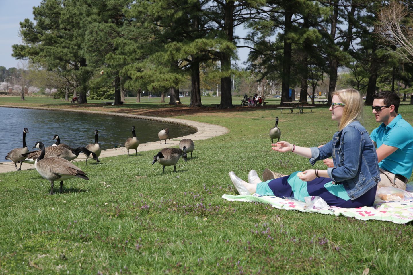
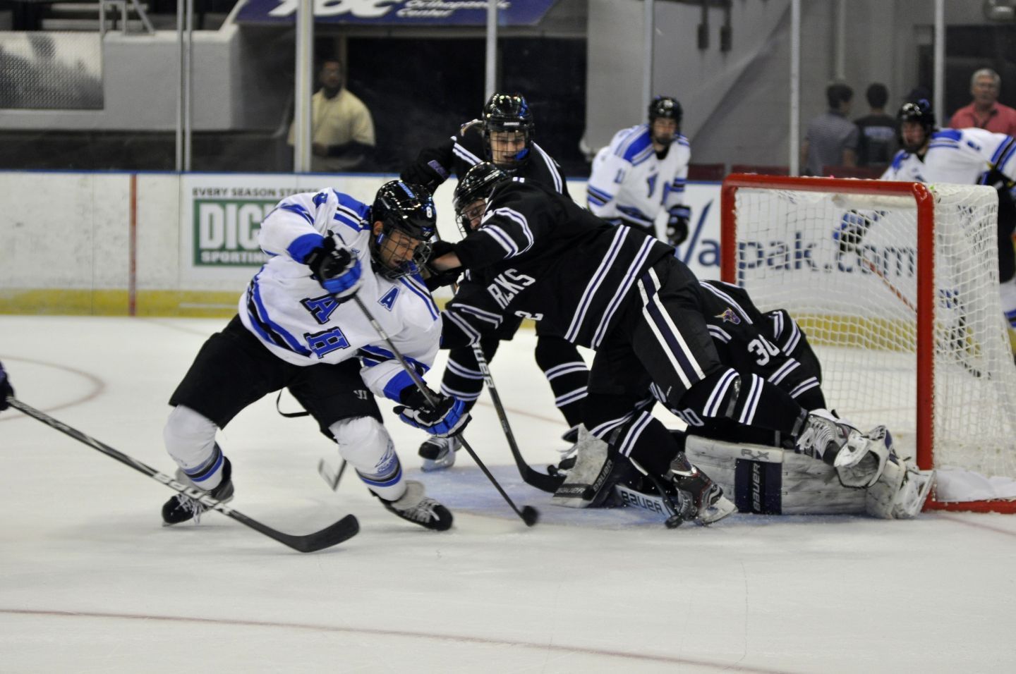
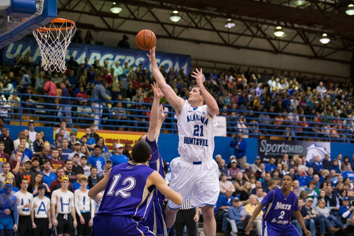
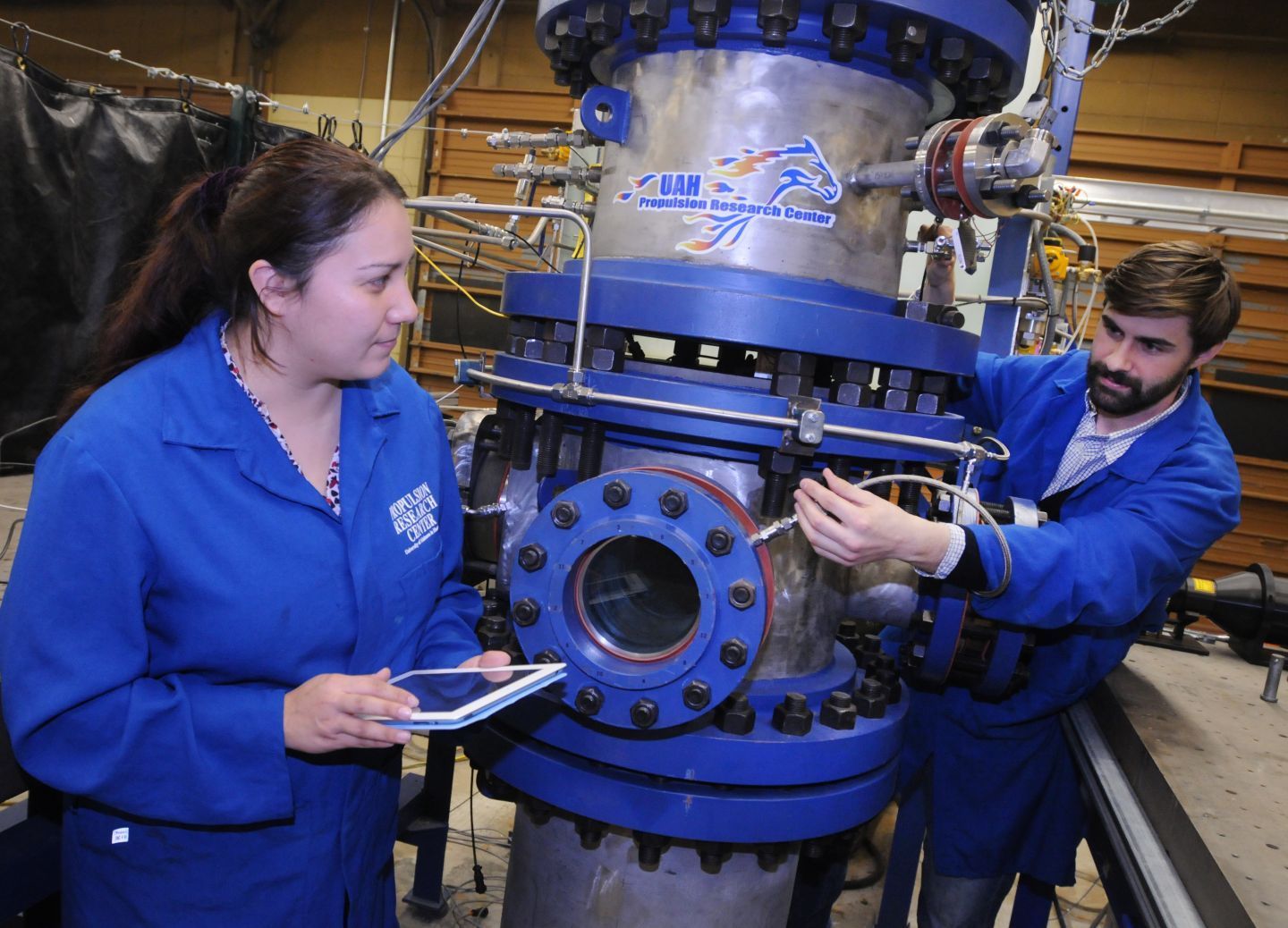
Images
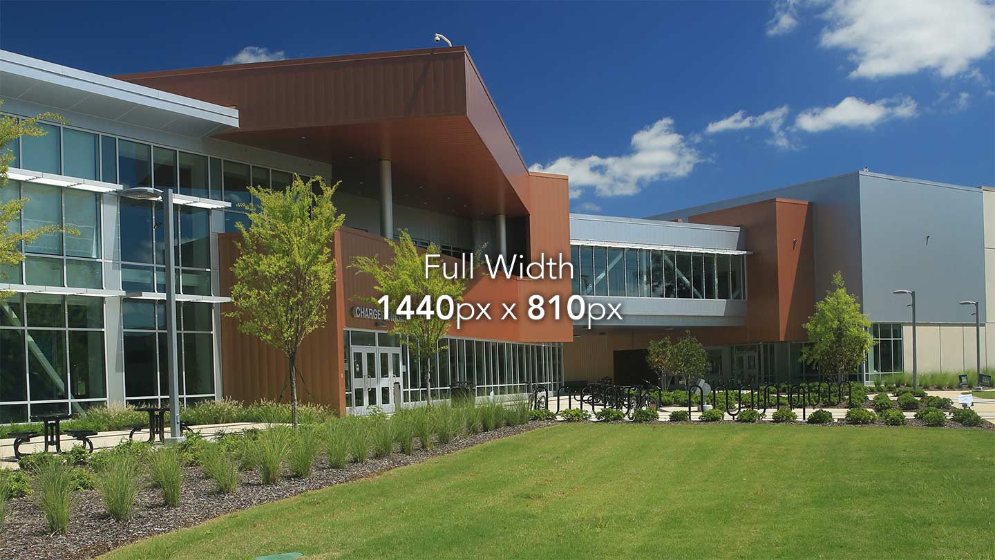
For best appearance across all screen sizes, images should be 16:9 ratio, landscape, and 1440px X 810px dimensions. If you need a tool for cropping or resizing your images, our Image Crop Tool is available.
Irregular images (portrait or tall) should be inline and 1/3 width.
Use the classes below to set the size and position for an image on your page. By using these classes, images will automatically adjust to their appropriate proportions without having to create different versions of the images.
OMC manages and maintains a library of photos taken by the university photographer in an online database application called Photoshelter.
For access to Photoshelter, send your request to webmaster@uah.edu.
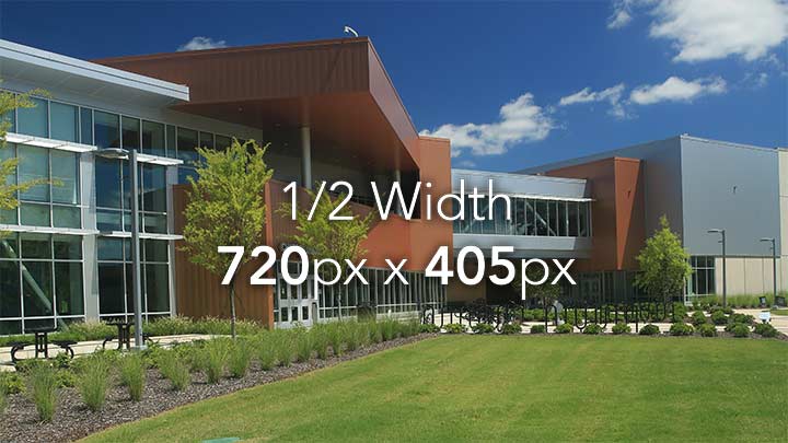
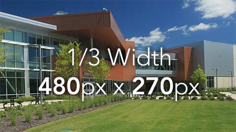
Image Positioning
| Align Left | Align Right | |
|---|---|---|
| Full width | N/A | N/A |
| 2/3 width | .left-66 |
.right-66 |
| 1/2 width | .left-50 |
.right-50 |
| 1/3 width | .left-33 |
.right-30 |
Advanced editors may want to use Bootstrap grid classes for more control over image sizes and layouts.
Example
Lorem ipsum dolor sit amet, consectetur adipiscing elit. Aliquam hendrerit mauris dictum metus porta, in consectetur dui aliquam. Nunc eu pharetra ipsum. Donec nec tincidunt dolor. Mauris dolor nisi, pellentesque quis tellus malesuada, placerat tristique dui.

Phasellus at dui in nunc vestibulum accumsan. Aliquam erat volutpat. Duis non interdum ipsum, et tristique leo. Pellentesque condimentum, felis id placerat placerat, purus purus mattis urna, ac sodales ipsum ipsum ut risus. Aenean eget molestie ante, nec blandit magna. Integer efficitur fringilla odio sit amet sagittis. Sed ante turpis, pulvinar condimentum vehicula ac, tempus cursus ante. Donec eu scelerisque metus. Vestibulum facilisis tincidunt fermentum. Phasellus consequat odio in libero pharetra rutrum.
Lorem ipsum dolor sit amet, consectetur adipiscing elit. Aliquam hendrerit mauris dictum metus porta, in consectetur dui aliquam. Nunc eu pharetra ipsum. Donec nec tincidunt dolor.
Lorem ipsum dolor sit amet, consectetur adipiscing elit. Aliquam hendrerit mauris dictum metus porta, in consectetur dui aliquam. Nunc eu pharetra ipsum. Donec nec tincidunt dolor. Mauris dolor nisi, pellentesque quis tellus malesuada, placerat tristique dui.
Phasellus at dui in nunc vestibulum accumsan. Aliquam erat volutpat. Duis non interdum ipsum, et tristique leo. Pellentesque condimentum, felis id placerat placerat, purus purus mattis urna, ac sodales ipsum ipsum ut risus. Aenean eget molestie ante, nec blandit magna. Integer efficitur fringilla odio sit amet sagittis. Sed ante turpis, pulvinar condimentum vehicula ac, tempus cursus ante. Donec eu scelerisque metus. Vestibulum facilisis tincidunt fermentum. Phasellus consequat odio in libero pharetra rutrum.
Lorem ipsum dolor sit amet, consectetur adipiscing elit. Aliquam hendrerit mauris dictum metus porta, in consectetur dui aliquam. Nunc eu pharetra ipsum. Donec nec tincidunt dolor.
Phasellus at dui in nunc vestibulum accumsan. Aliquam erat volutpat. Duis non interdum ipsum, et tristique leo. Pellentesque condimentum, felis id placerat placerat, purus purus mattis urna, ac sodales ipsum ipsum ut risus. Aenean eget molestie ante, nec blandit magna. Integer efficitur fringilla odio sit amet sagittis.
Phasellus at dui in nunc vestibulum accumsan. Aliquam erat volutpat. Duis non interdum ipsum, et tristique leo. Pellentesque condimentum, felis id placerat placerat, purus purus mattis urna, ac sodales ipsum ipsum ut risus. Aenean eget molestie ante, nec blandit magna. Integer efficitur fringilla odio sit amet sagittis. Sed ante turpis, pulvinar condimentum vehicula ac, tempus cursus ante. Donec eu scelerisque metus. Vestibulum facilisis tincidunt fermentum. Phasellus consequat odio in libero pharetra rutrum.
Lorem ipsum dolor sit amet, consectetur adipiscing elit. Aliquam hendrerit mauris dictum metus porta, in consectetur dui aliquam. Nunc eu pharetra ipsum. Donec nec tincidunt dolor.
. . .


. . .


. . .


. . .
Saving Images for Web
These image sizes are larger than their display area in order to appear sharp on hi-resolution screens (such as retina displays on iPads, iPhones, etc.). It’s best practice to save these images with a high JPEG compression in order to keep the file size low and the page load times short.
In Photoshop, select Save for Web and then set the JPEG quality to 35.
Image Captions
Image captions should be as concise as possible and a maximum of 250 characters. Captions are overlaid on the bottom of the image. On extra-small devices, the caption moves below the image to avoid covering too much of the image.
Example
Here is a caption with a description of the above photo.
Here is a caption with a description of the above photo.


Photo Credit
Caption Below Image
For narrower photos and/or longer captions, add .caption-below to force the caption to appear below the image at all screen sizes.
Example
Here is a caption with a description of the below the photo. Longer captions such as this should go below the photos, so as not to cover too much of the photos.
Here is a caption with a description of the below the photo.  Longer captions such as this should go below the photos, so as not to cover too much of the photos.


Photo Credit
Carousel
Carousels are useful for showcasing a sequence of photos or graphics.
- Carousels should be block-level items (full width on page, not inline)
- Carousels should be limited to one per page
- Carousels should contain a maximum of 5 images
- Carousels are automatically cropped to a 16x9 ratio
- Carousel images should be 1440x810
- Carousels should include jump (dot) navigation in the top left corner or below the carousel
- Carousels should include previous/next arrow navigation
- Carousels may display captions for each image
Example


Carousels on the UAH site are built using the Droppics gallery builder within the Joomla article editor.
Gallery
Galleries are used to display a large number of photos
- Galleries should be block-level items (full width on page, not inline)
- Galleries need context - at minimum a sentence introducing the gallery
- Galleries should be limited to one per page
- Galleries should contain a minimum of 5 images
- Thumbnails are cropped square and available in 3 sizes:
- small - 9/row (desktop), 5/row (mobile)
- normal - 7/row (desktop), 4/row (mobile)
- large - 5/row (desktop), 3/row (mobile)
- When clicked, images open in a lightbox or modal
- Each full-size image should display an appropriate caption
- Each full-size image should be at least 1440 x 810 pixels
Example


Galleries on the UAH site are built using the Droppics gallery builder within the Joomla article editor.
Videos
Want to embed a video? Contact webmaster@uah.edu for your website video needs.
Buttons
Buttons elicit action from visitors and are thus used to highlight important links and actions on a page. Multiple sizes are available to match surrounding style and to convey importance.
Button Use Recommendations:
- The yellow “UAH” button should be reserved for the most important link or action on the page. A yellow button stands out and draws the eye; use it sparingly to achieve the page's main purpose. Too many yellow buttons on a single page create visual "noise" that makes the page's main objective harder for the user to identify.
- The blue “Primary” button should be used for secondary action items on the page that link to other UAH website pages.
- The gray “Default” button should be used for navigation sections, such as a linkgrid module.
- The “Black” button is a secondary button that designates a link that will take the user away from the UAH website.
Example
- Will this link take the user away from the UAH website? No | Yes
- Select a Button Type by clicking on one of the above buttons.
- Supply the Button Title:
- Supply the URL for the Button:
Code Will Be Here
Contextual Buttons
These buttons should only be used in their respective context in forms and applications.
Tables
Tables are used for displaying tabular data, data you would find in a spreadsheet. Tables are not to be used for layout or formatting of pages, as this does not allow for reformatting required for responsive layouts.
Basic Table
For basic styling — light padding and only horizontal dividers — add the base class .table to any <table>.
Important
All tables should have the class .table. By assigning this class, each table is automatically styled, made responsive, and made accessible.
Example
| A | B | C | |
|---|---|---|---|
| 1 | A1 | B1 | C1 |
| 2 | A2 | B2 | C2 |
| 3 | A3 | B3 | C3 |
A B C
1
A1
B1
C1
2
A2
B2
C2
3
A3
B3
C3
Condensed Table
Add .table-condensed to make tables more compact by cutting cell padding in half.
Add .table-xs-condensed to apply this style only on extra-small devices.
Example
| A | B | C | |
|---|---|---|---|
| 1 | A1 | B1 | C1 |
| 2 | A2 | B2 | C2 |
| 3 | A3 | B3 | C3 |
A B C
1
A1
B1
C1
2
A2
B2
C2
3
A3
B3
C3
Striped Table
Use .table-striped to add zebra-striping to any table row within the <tbody>.
Example
| A | B | C | |
|---|---|---|---|
| 1 | A1 | B1 | C1 |
| 2 | A2 | B2 | C2 |
| 3 | A3 | B3 | C3 |
A B C
1
A1
B1
C1
2
A2
B2
C2
3
A3
B3
C3
Hover Rows Table
Add .table-hover to enable a hover state on table rows within a <tbody>.
Example
| A | B | C | |
|---|---|---|---|
| 1 | A1 | B1 | C1 |
| 2 | A2 | B2 | C2 |
| 3 | A3 | B3 | C3 |
A B C
1
A1
B1
C1
2
A2
B2
C2
3
A3
B3
C3
Bordered Table
Add .table-bordered for borders on all sides of the table and cells.
Example
| A | B | C | |
|---|---|---|---|
| 1 | A1 | B1 | C1 |
| 2 | A2 | B2 | C2 |
| 3 | A3 | B3 | C3 |
A B C
1
A1
B1
C1
2
A2
B2
C2
3
A3
B3
C3
Sortable Table
Add .table-sort to allow users to sort your table by column.
Example
| A | B | C | |
|---|---|---|---|
| 1 | A1 | B1 | C1 |
| 2 | A2 | B2 | C2 |
| 3 | A3 | B3 | C3 |
A B C
1
A1
B1
C1
2
A2
B2
C2
3
A3
B3
C3
Forms
Google Forms
Google Forms empowers you to build forms and collect results. YouTube has a plethora of walkthroughs that cover every aspect of building and using Google Forms. Refer to YouTube for instructions on how to build a Google Form. Below are a few best practices and helpful tips while using Google Forms across the UAH site.
When using Google Forms, remember these best practices and helpful tips:
- Create the Google Form using an entity account. For example, college@uah.edu or department@uah.edu instead of a personal account such as first.last@uah.edu. When using an entity account, you reduce the risk of the college/department losing access to the Google Form.
- After building the Google Form set the form to record results in a Google Spreadsheet. This allows for easy viewing, sharing, and monitoring results. Google Forms provides several reporting options and can send you notifications when a new entry is received.
- Google Forms allows you to set auto-response on form submission. You can respond with custom welcome messages, acknowledge support requests, send confirmation emails, and more. However, If you don't want to auto-respond, this feature can be deactivated.
- Google Forms belongs to a family of Google products. Results are more accessible within this family of products, are backed up online, and can easily be exported into other formats. Get familiar with the Google family of products to better understand their potential for your data management needs.
- Google Forms can be set public or private. This controls who can view and use the form. By default, a form is set as private. Remember to change this setting based on your needs.
Emma Forms
Creating sign-up forms for Emma email service mailing lists is outlined on the Emma website.
When Embedding Emma forms on the UAH website, remember:
- You must have an Emma account set up through the OMC to have a form embedded on the site.
- It must be a regular sign-up form - not a lightbox. Lightboxes are not ADA compliant.
- If the form is to be embedded on the UAH website, it must not contain any logos or imagery.
- Please be sure to format all response emails in Emma before adding the form to the website.
- OMC will place the embed code for the form on the UAH site so that any formatting for responsiveness can be addressed immediately.
If you have any questions about placing Emma forms on the UAH website, please contact webmaster@uah.edu for assistance.
Show/Hide Content
Use these utility classes for showing and hiding content based on the user's device size.
Use these on a limited basis and avoid creating entirely different versions of the same site. Mobile users get frustrated when they aren't able to see the same content as desktop users.
| Extra-small devices Phones (<700px) | Small devices Tablets (≥700px) | Medium devices Desktops (≥900px) | Large devices Desktops (≥990px) | |
|---|---|---|---|---|
.visible-xs |
Visible | Hidden | Hidden | Hidden |
.visible-sm |
Hidden | Visible | Hidden | Hidden |
.visible-md |
Hidden | Hidden | Visible | Hidden |
.visible-lg |
Hidden | Hidden | Hidden | Visible |
.hidden-xs |
Hidden | Visible | Visible | Visible |
.hidden-sm |
Visible | Hidden | Visible | Visible |
.hidden-md |
Visible | Visible | Hidden | Visible |
.hidden-lg |
Visible | Visible | Visible | Hidden |
Content Grouping
Wells, panels, and callouts are available to help visually group content.
Wells
Wells are most often used in the sidebar to group content that may or may not be related to its surrounding content.
Example
Callouts
Example
Remember
Blue callouts display information that may be relevant to the current task.


Important
Yellow callouts display information that is important to the current task.
Remember
Blue callouts display information that may be relevant to the current task.
Important
Yellow callouts display information that is important to the current task.
Panels
Panels are most often used to group content that is related to the surrounding content.
Example
Important Dates


November: Get your FAFSA pin
January: Fill out your FAFSA online at fafsa.gov
May-August: Complete loan entrance counseling and sign the promissory note at https://studentaid.gov


Important Dates


November: Get your FAFSA pin
January: Fill out your FAFSA online at fafsa.gov
May-August: Complete loan entrance counseling and sign the promissory note at https://studentaid.gov
Important Dates
November: Get your FAFSA pin
January: Fill out your FAFSA online at fafsa.gov
May-August: Complete loan entrance counseling and sign the promissory note at https://studentaid.gov
Important Dates
November: Get your FAFSA pin
January: Fill out your FAFSA online at fafsa.gov
May-August: Complete loan entrance counseling and sign the promissory note at https://studentaid.gov
Expanding Panels
Use expanding panels to condense very long content into more navigable groups.
Example
Panel 1 Body - Lorem ipsum dolor sit amet, consectetur adipiscing elit. Aliquam hendrerit mauris dictum metus porta, in consectetur dui aliquam. Nunc eu pharetra ipsum. Donec nec tincidunt dolor. Mauris dolor nisi, pellentesque quis tellus malesuada, placerat tristique dui.
Panel 2 Body - Lorem ipsum dolor sit amet, consectetur adipiscing elit. Aliquam hendrerit mauris dictum metus porta, in consectetur dui aliquam. Nunc eu pharetra ipsum. Donec nec tincidunt dolor. Mauris dolor nisi, pellentesque quis tellus malesuada, placerat tristique dui.
Panel 3 Body - Lorem ipsum dolor sit amet, consectetur adipiscing elit. Aliquam hendrerit mauris dictum metus porta, in consectetur dui aliquam. Nunc eu pharetra ipsum. Donec nec tincidunt dolor. Mauris dolor nisi, pellentesque quis tellus malesuada, placerat tristique dui.