Tips before you start
Our website has been optimized to work best with horizontal pictures, or photos using a landscape orientation. Please keep this in mind when adding pictures to articles.
Joomla's file size limit for uploads is 1 MB, although 250 KB or less is most desirable to ensure faster load times.
Images should ideally be 1440px wide and 810px in height. This uses a 16:9 ratio. In order to meet these requirements, your image will most likely need to be cropped using a photo editor before you upload it to joomla to fit these proportions.
Example of landscape/horizontal orientation
desired
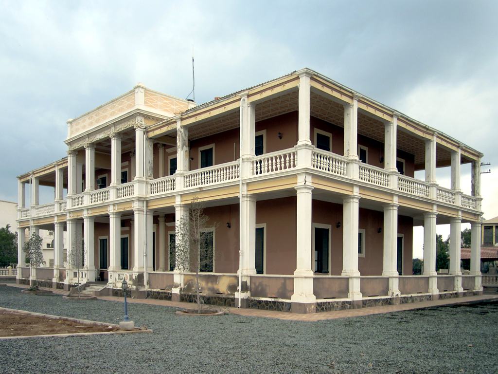
"City Administration Building" by D-Stanley is licensed under CC BY 2.0
Example of portrait/vertical orientation
undesired

"Zebra portrait" by @Doug88888 is licensed under CC BY-NC-SA 2.0
Instructions for Inserting Images
- In the editor window, place your cursor on the spot on page where you would like to place an image.
Note: In order for image wrapping to work properly, insert the image before the text where you want it to appear.
- Click the
 Insert/Edit Image button.
 - In the Image Manager pop-up window, in the bottom-left File Browser area, click through the folders until you locate the one that is appropriate for your site - be sure to click down all the way to a folder you have access to.
- In the middle-right area of the window, click the
 button (the image up arrow icon).
 - In the Upload window, drag and drop or
 to select the image saved to your desktop.
 - Click the
 button.
 - Click your image listed in the folder details area in the bottom-middle twice, until the preview in the top-right displays a thumbnail of your image.
- In the top Properties area, update the Alternate Text with a short description of the image.
Note: To be ADA-friendly, an image should have descriptive Alternate Text so that screen readers can describe the image accurately.
- Click
 .
. - Click
 and view your image.
Sizing and Positioning Images
Use predefined classes to change the display size of an image and make it float to the right or left of your text.
Our website is responsive - meaning it adapts and shifts or "responds" to the size of a user's screen. This means someone on a desktop computer will see things one way, but a user on a tablet or phone may see our content a little differently.
Images sizes are relative to the width of the page, depending on the user's screen size.
For example, applying the class "left-50" to an image means that it will float on the left side of the page and the width of that image will take up one-half of that content area. However, that same image will be displayed at 100% width on smaller screen sizes
Example of an image displayed using left-50 class. On a desktop computer, this image will take up half of the content area.

On a small screen (i.e., phone), this image's width will fill 100% of the content area. This mobile screenshot is also an excellent example of why a portrait-oriented (vertical) image is not ideal.
Instructions for Sizing and Positioning Images
- Click on the image to select it.
- Click the Classes drop down.
- Select one of the following options to align and size your image:
- styles (Default, Image at 100% width)
- right-66 (right align, 2/3 size)
- right-50 (right align, 1/2 size)
- right-33 (right align, 1/3 size)
- left-66 (left align, 2/3 size)
- left-50 (left align, 1/2 size)
- left-33 (left align, 1/3 size)
- Click Save & Close.
- View your image.
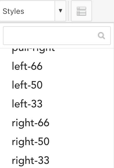
Once you select an image in the Joomla editor, use this Classes dropdown menu to select how to size and position your image.